University of Michigan-Dearborn graduate studies website- Information architecture redesign
Project Type
Professional Project at University of Michigan-Dearborn
My Role
UX Researcher and Designer
Methods
Benchmarking, focus group interviews, card sorting, wireframing, prototyping, usability testing
Deliverables
Site maps, information architecture, wireframes, research reports
Tools
Figma, Miro, Google Meet
How I conducted research to improve the information architecture of a graduate studies website, reducing error rate by 35% and improving task completion rate by 44%
01
The Problem
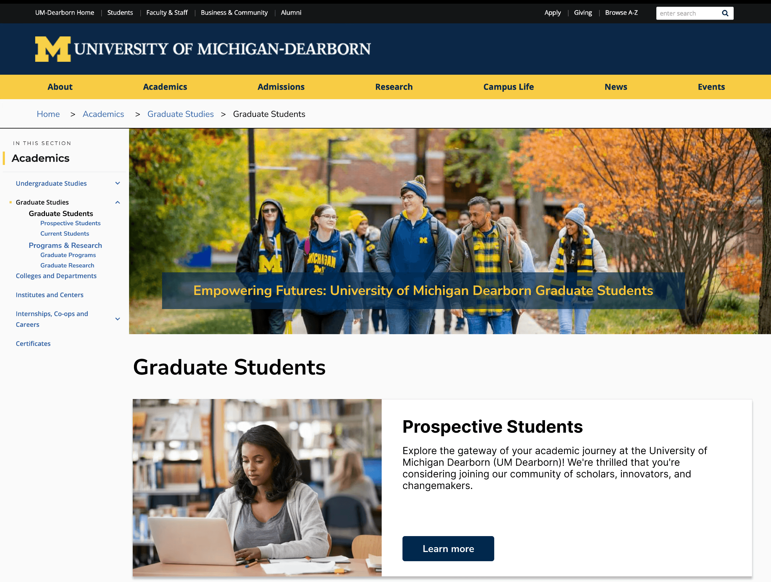
Users of the University of Michigan-Dearborn (UMD) website found it difficult to navigate and locate the content they needed. This led to a rise in escalations to the Office of Graduate Studies. Consequently, a user study was conducted to investigate the navigational challenges and redesign the website's information architecture.
02
Research Approach

03
Impact
Reduced error rate by
35%
Improved task completion rate by
44%
Here's a more detailed view of the project….
01
User Research
Benchmarking
Goal
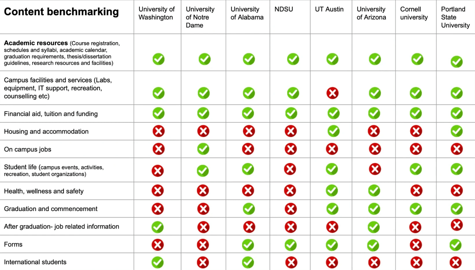
Compare the navigation systems and structures of different graduate school websites to assess their effectiveness, efficiency, and user-friendliness.
No. of Universities benchmarked: 15 (Graduate school section)
Most universities had a separate page for graduate studies
Information such as academic resources, campus facilities and services, and financial aid were easily accessible on most graduate school websites
Although this content was available on the University of Michigan-Dearborn website, it was embedded in sub-pages/links and was not easily discoverable
Focus group interviews
Goal
Gather current experiences, pain points of different target users of the graduate studies website
Understand the needs and expectations of the target groups
Target Groups
Prospective students, Current students, Faculty and staff
Qualitative data collected
Frequency of usage of graduate studies website
Most searched information
Current navigation feedback
Current information locating patterns
Information important while applying to graduate schools
Information missing/to be included in the graduate studies website
Areas of improvement
Quantitative data collected
Ranking of contents based on benchmarking
Ranking of navigation and overall experience of the graduate studies website
Results
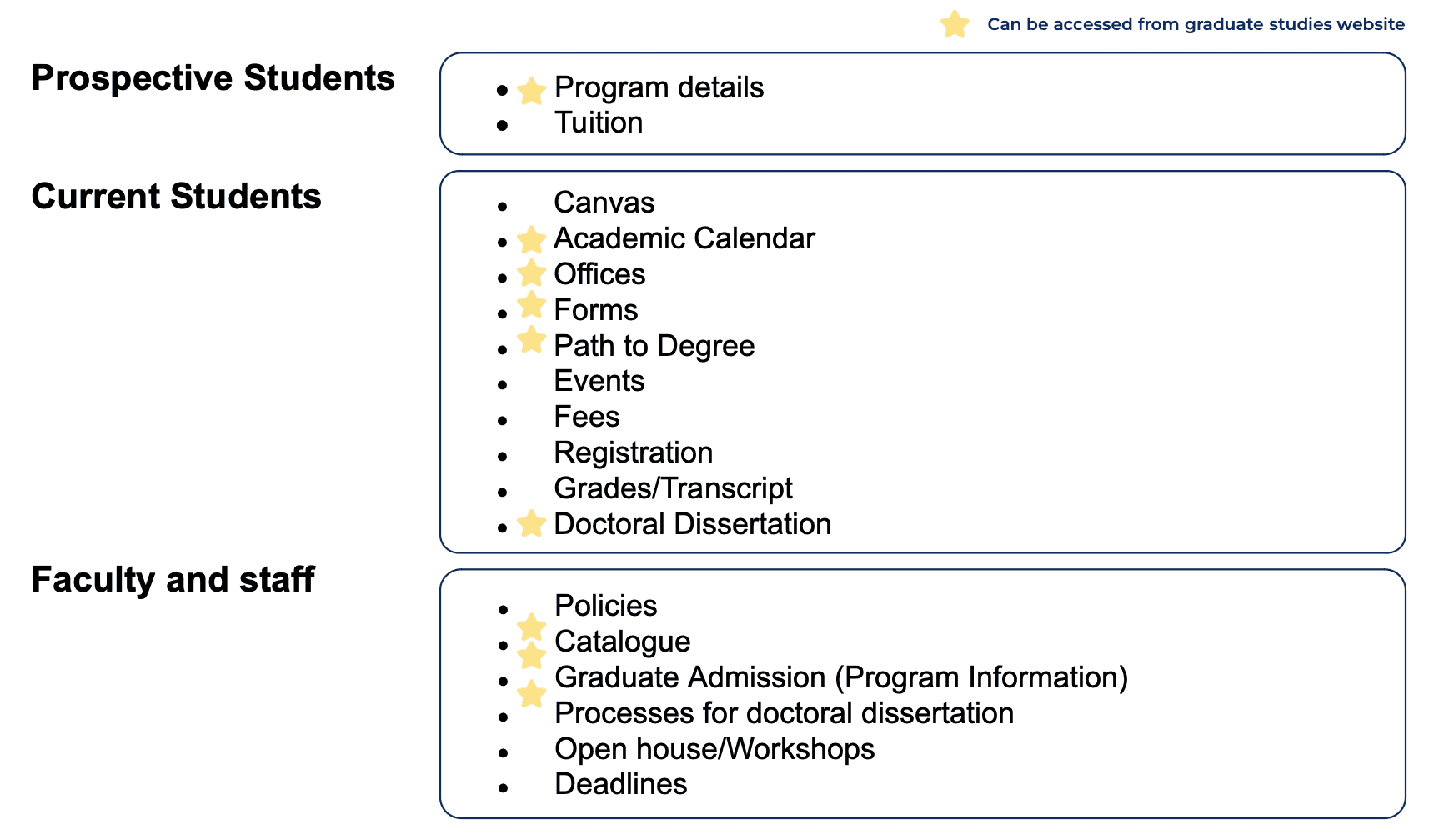
Most visited information
Navigation Patterns
Participants commonly looked for information through:
University of Michigan-Dearborn website search
Google search
My UM-Dearborn portal
Email advisors
Navigation Feedback
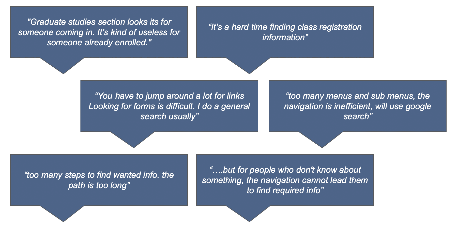
Users find the current navigation of the graduate studies section inefficient and cumbersome. They struggle with locating class registration information, forms, and other needed resources due to excessive menus, sub-menus, and lengthy navigation paths.
Ranking of Content
All user groups recognize the crucial role of academic resources
Prospective students place significant importance on tuition costs and job opportunities post-graduation
Faculty and staff place comparatively equal emphasis on all the potential contents
Pain Points
Lengthy and text-heavy contents
Out of date or inaccurate information
Accessibility of information (navigation/info location on the page)
Poor search experience
02
Information architecture development
Goal
Organize content with clear navigation paths
Better findability and quick access to important information
Method
Based on the data gathered from the interviews, an inductive approach was followed to was categorize them
2 strategies were considered
Chronological events in a student's life
Student type and program information

We followed the second approach to develop the information architecture
Important changes in the information architecture
Categorization based on types of students and program & research
Quick links for more most searched content
Balanced the breadth and depth of the information architecture
Eliminated content being embedded in sub pages and footers
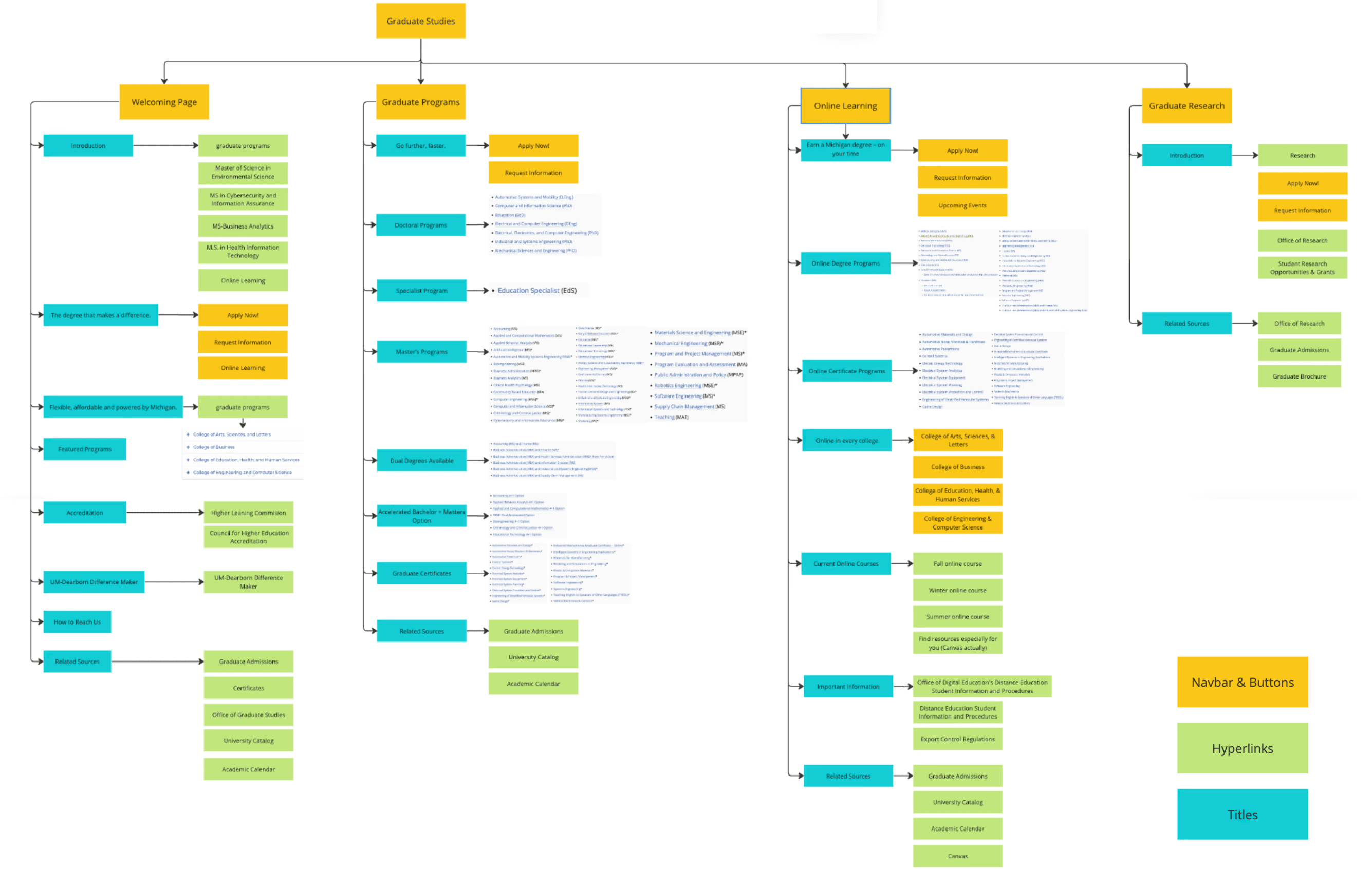
Current site map
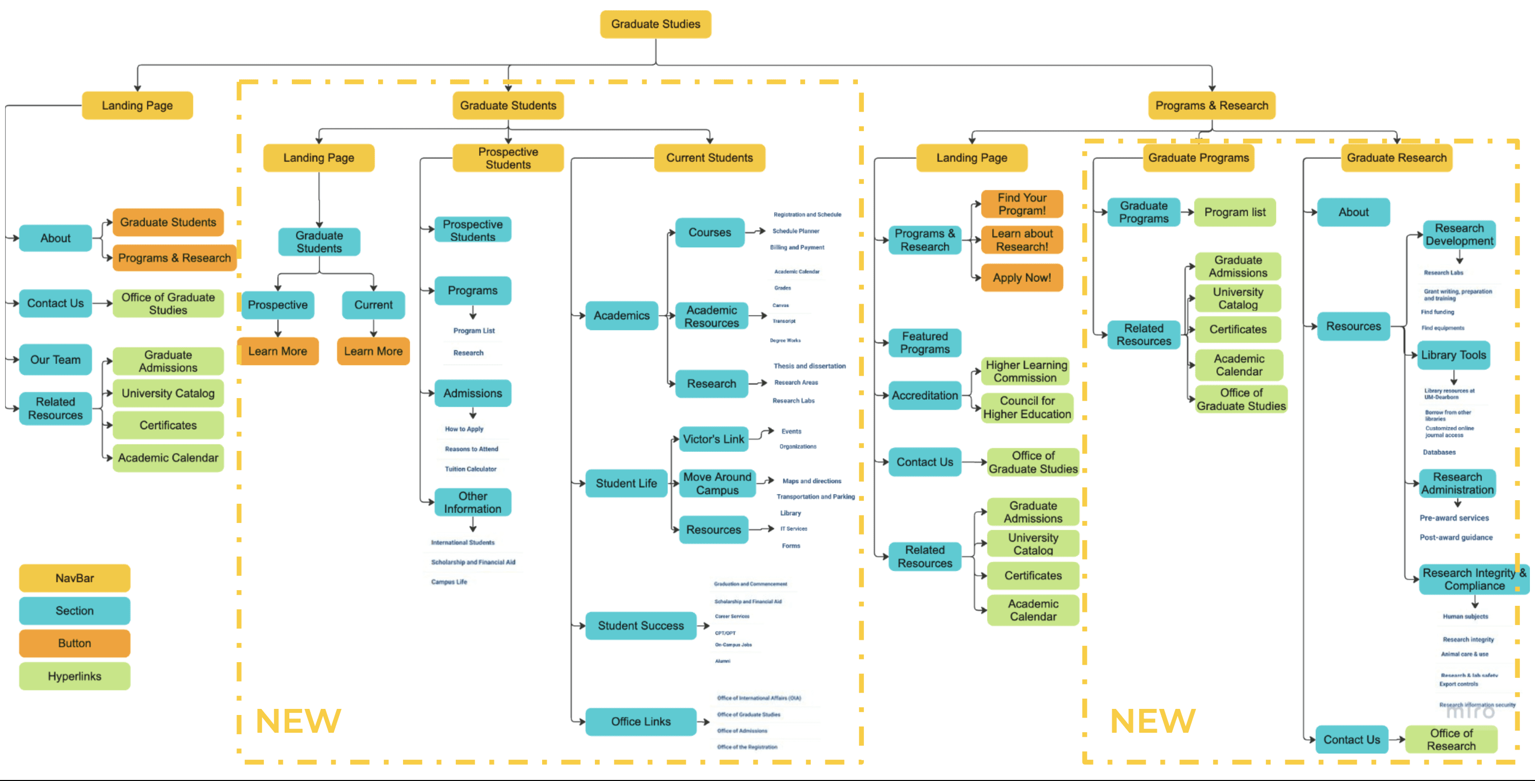
New site map
03
Prototype
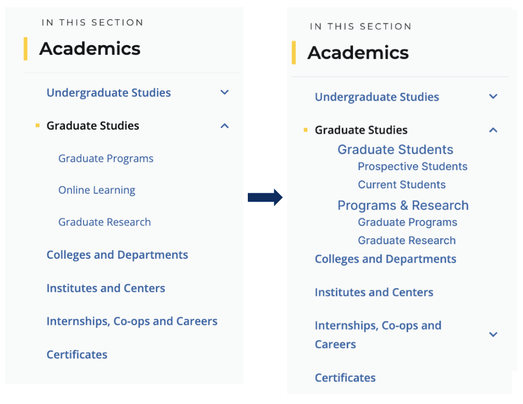
Changes in left navigation
All groups expressed the need for individual navigation entry for different users
Information was organized into more pages to avoid lengthy and text heavy pagesT
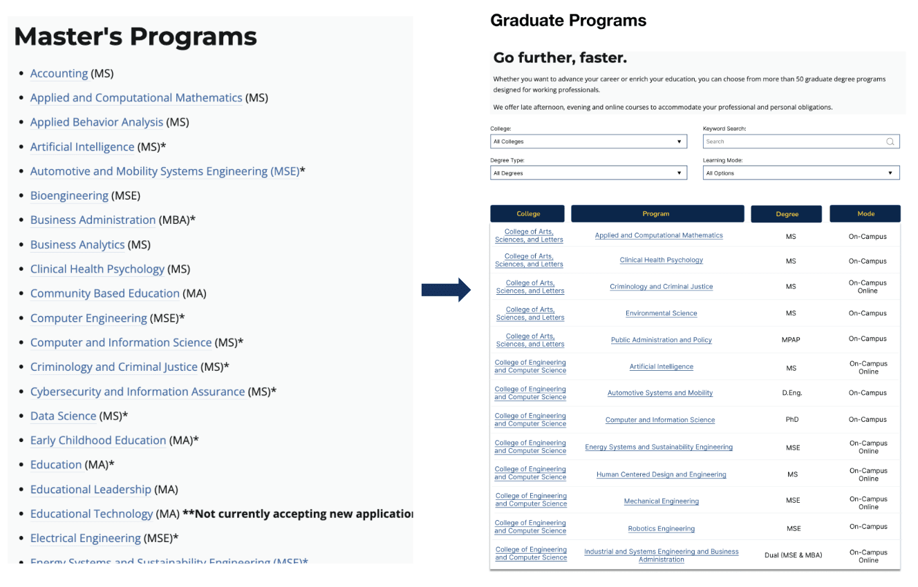
Program search filters
Compared to the previous extensive list of programs, we introduced a filtered search feature. We also added crucial information, such as the learning mode and the associated college, to be immediately visible.
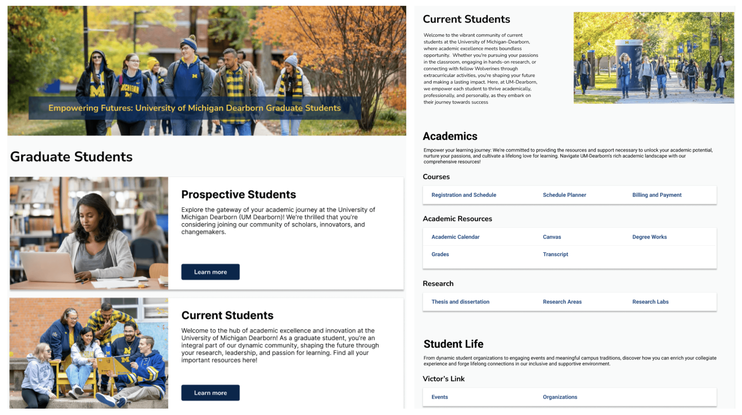
Easily accessible links
Previously, the information was hidden in sub-pages and links. We added quick links on the main pages to make the content more accessible.
04
Usability Test
Participants
New participants and people who took part in the first round user interviews
8 participants –– 1 prospective student, 4 current students, 3 professors & staff
Procedure
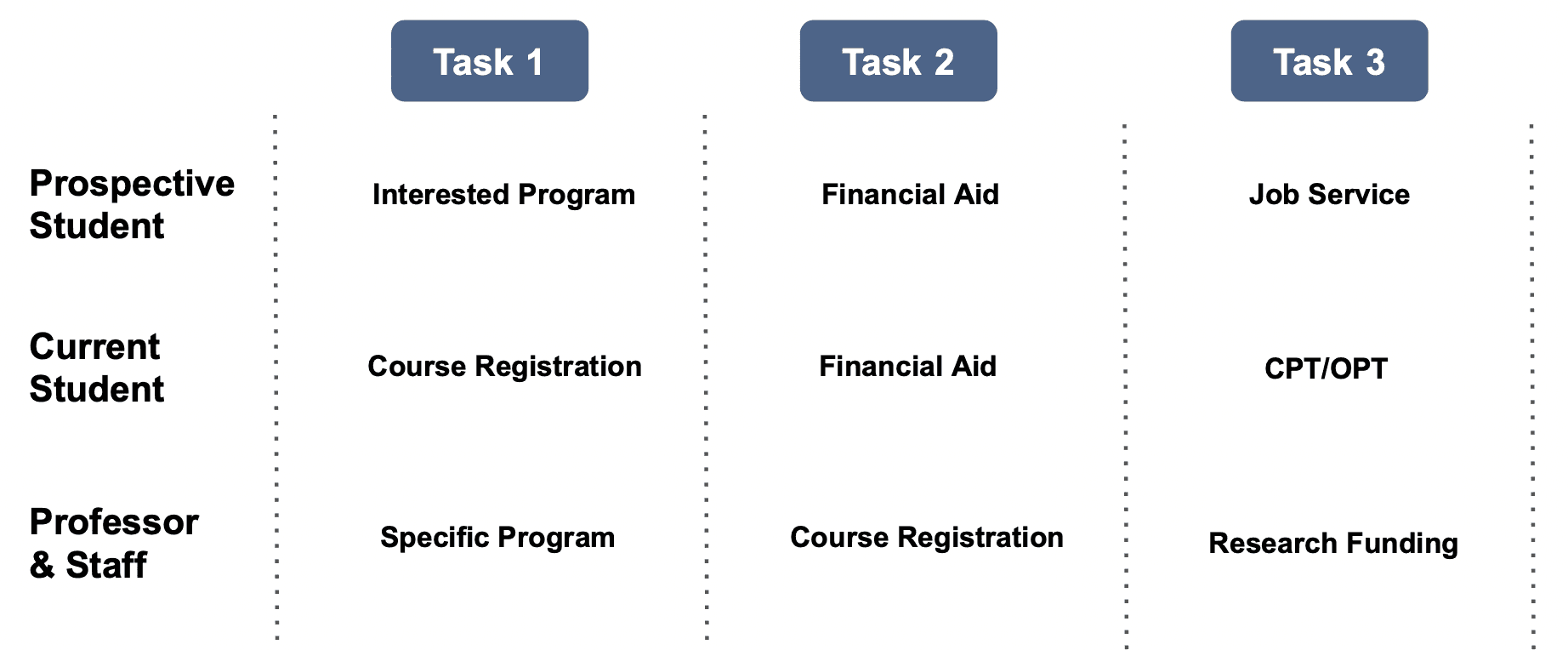
Participants were given 3 tasks (different tasks for each group)
Participants performed tasks on the current website and the prototypes (A/B Testing)
Task completion, number of clicks and errors were recorded
After task a survey was conducted to gather qualitative comments on the current website and the prototype
Brief after-task interview
Task
Tasks were selected based on the importance rated by different user groups.
05
Outcome
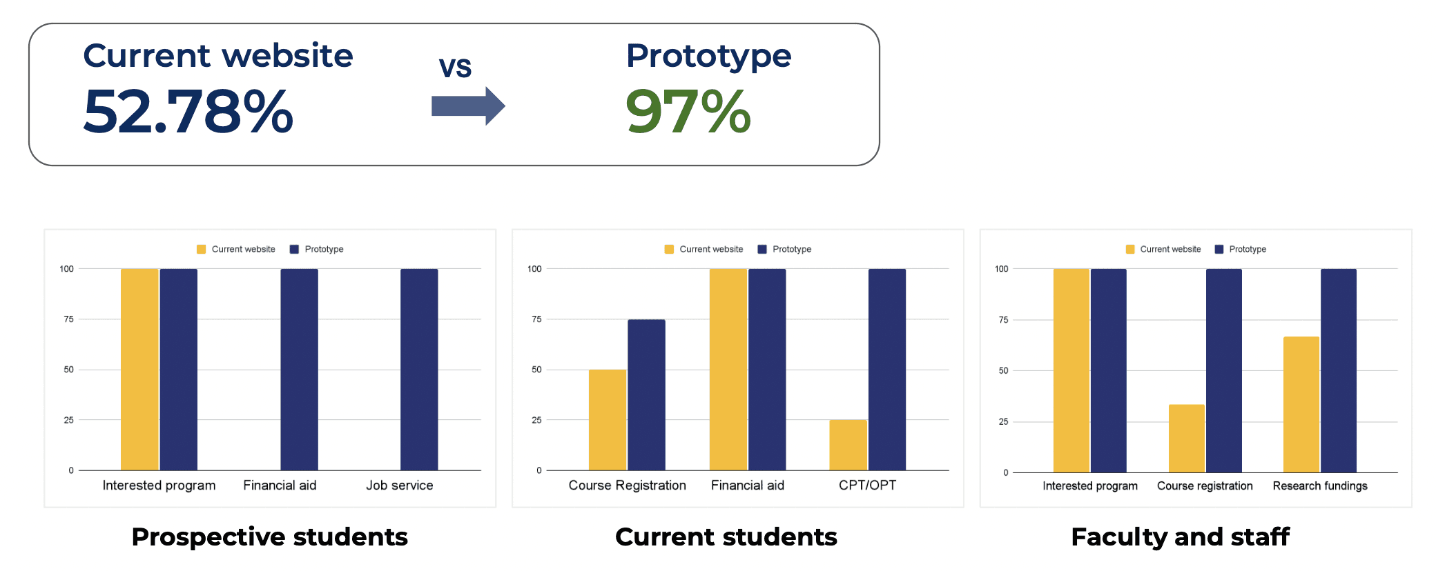
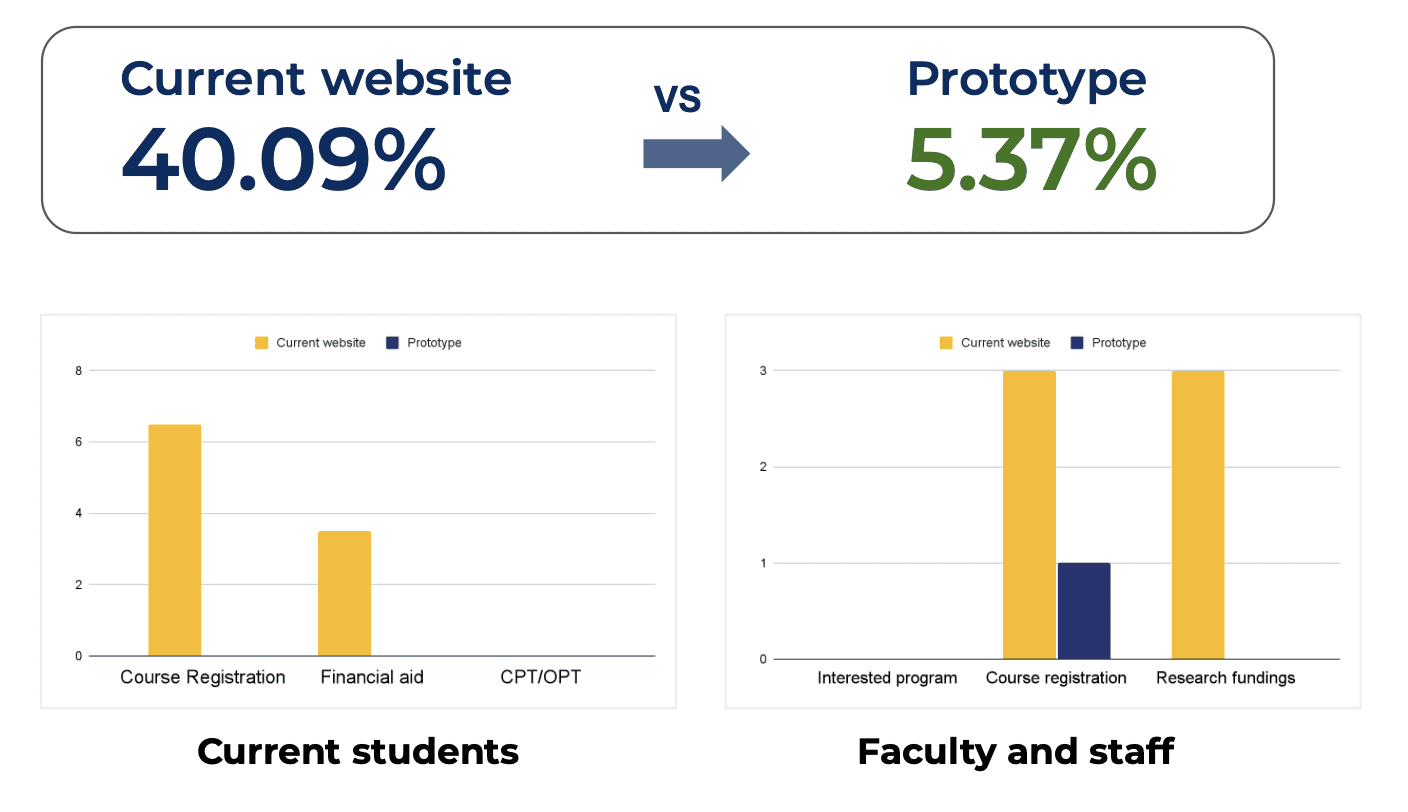
Average Task Completion Percentage
Average Error Rate
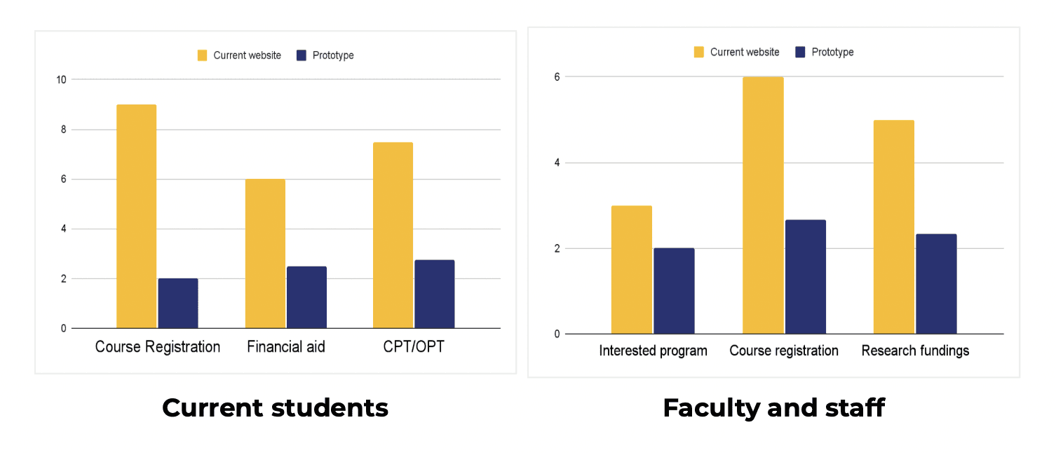
Number of Clicks
The current website had a higher number of clicks than the prototype
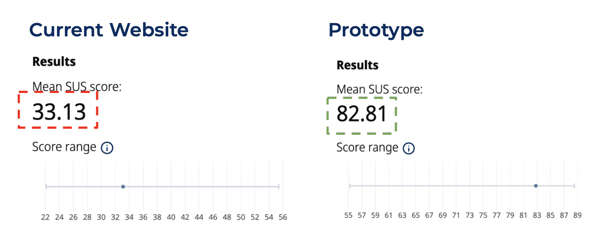
SUS Score
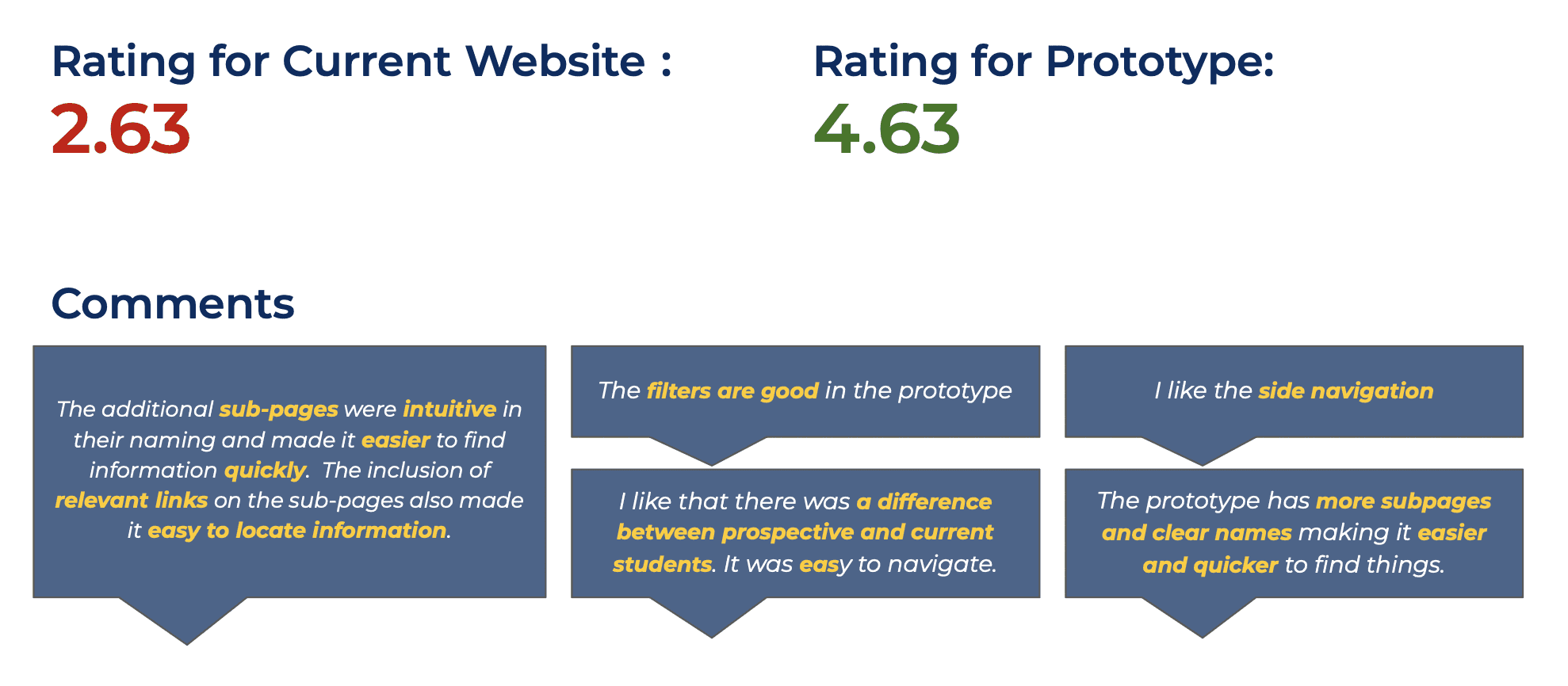
User Satisfaction
06
Reflections
Balancing consistency while redesigning an existing system
I learned that redesigning navigation within an existing design is more challenging than starting from scratch. It’s about finding the balance between introducing new ideas and maintaining consistency with established elements, ensuring that the changes still feel familiar and intuitive for users.
Leveraging mixed methods for comprehensive user insights
Using a mix of surveys and focus group interviews was a valuable approach that allowed me to gather both broad quantitative data and in-depth qualitative insights. Surveys helped me collect data from a larger sample, offering measurable trends and patterns, while focus groups provided a deeper understanding of users' pain points and needs.
SWARNA
©
Swarna Pandu
2024
06
Reflections
Balancing consistency while redesigning an existing system
I learned that redesigning navigation within an existing design is more challenging than starting from scratch. It’s about finding the balance between introducing new ideas and maintaining consistency with established elements, ensuring that the changes still feel familiar and intuitive for users.
Leveraging mixed methods for comprehensive user insights
Using a mix of surveys and focus group interviews was a valuable approach that allowed me to gather both broad quantitative data and in-depth qualitative insights. Surveys helped me collect data from a larger sample, offering measurable trends and patterns, while focus groups provided a deeper understanding of users' pain points and needs.
University of Michigan-Dearborn graduate studies website- Information architecture redesign
Project Type
Professional Project at University of Michigan-Dearborn
My Role
UX Researcher and Designer
Methods
Benchmarking, focus group interviews, card sorting, wireframing, prototyping, usability testing
Deliverables
Site maps, information architecture, wireframes, research reports
Tools
Figma, Miro, Google Meet
How I redesigned the information architecture of a graduate studies website and reduced error rate by 35% and improved task completion by 44%
01
The Problem
Users of the University of Michigan-Dearborn (UMD) website found it difficult to navigate and locate the content they needed. This led to a rise in escalations to the Office of Graduate Studies. Consequently, a user study was conducted to investigate the navigational challenges and redesign the website's information architecture.


01
User Research
Benchmarking
Goal
Compare the navigation systems and structures of different graduate school websites to assess their effectiveness, efficiency, and user-friendliness.
No. of Universities benchmarked: 15 (Graduate school section)
Most universities had a separate page for graduate studies
Information such as academic resources, campus facilities and services, and financial aid were easily accessible on most graduate school websites
Although this content was available on the University of Michigan-Dearborn website, it was embedded in sub-pages/links and was not easily discoverable


Focus group interviews
Goal
Gather current experiences, pain points of different target users of the graduate studies website
Understand the needs and expectations of the target groups
Target Groups
Prospective students, Current students, Faculty and staff
Qualitative data collected
Frequency of usage of graduate studies website
Most searched information
Current navigation feedback
Current information locating patterns
Information important while applying to graduate schools
Information missing/to be included in the graduate studies website
Areas of improvement
Quantitative data collected
Ranking of contents based on benchmarking
Ranking of navigation and overall experience of the graduate studies website
Results
Most visited information


Navigation Patterns
Participants commonly looked for information through:
University of Michigan-Dearborn website search
Google search
My UM-Dearborn portal
Email advisors
Navigation Feedback
Users find the current navigation of the graduate studies section inefficient and cumbersome. They struggle with locating class registration information, forms, and other needed resources due to excessive menus, sub-menus, and lengthy navigation paths.


Ranking of Content
All user groups recognize the crucial role of academic resources
Prospective students place significant importance on tuition costs and job opportunities post-graduation
Faculty and staff place comparatively equal emphasis on all the potential contents
Pain Points
Lengthy and text-heavy contents
Out of date or inaccurate information
Accessibility of information (navigation/info location on the page)
Poor search experience
02
Information architecture development
Goal
Organize content with clear navigation paths
Better findability and quick access to important information
Method
Based on the data gathered from the interviews, an inductive approach was followed to was categorize them
2 strategies were considered
Chronological events in a student's life
Student type and program information


We followed the second approach to develop the information architecture
Important changes in the information architecture
Categorization based on types of students and program & research
Quick links for more most searched content
Balanced the breadth and depth of the information architecture
Eliminated content being embedded in sub pages and footers


Current site map


New site map
03
Prototype
Changes in left navigation
All groups expressed the need for individual navigation entry for different users
Information was organized into more pages to avoid lengthy and text heavy pagesT


Program search filters
Compared to the previous extensive list of programs, we introduced a filtered search feature. We also added crucial information, such as the learning mode and the associated college, to be immediately visible.


Easily accessible links
Previously, the information was hidden in sub-pages and links. We added quick links on the main pages to make the content more accessible.


04
Usability Test
Participants
New participants and people who took part in the first round user interviews
8 participants –– 1 prospective student, 4 current students, 3 professors & staff
Procedure
Participants were given 3 tasks (different tasks for each group)
Participants performed tasks on the current website and the prototypes (A/B Testing)
Task completion, number of clicks and errors were recorded
After task a survey was conducted to gather qualitative comments on the current website and the prototype
Brief after-task interview
Task
Tasks were selected based on the importance rated by different user groups.


05
Outcome
Average Task Completion Percentage


Average Error Rate


Number of Clicks
The current website had a higher number of clicks than the prototype


SUS Score


User Satisfaction


02
Research Approach


03
Impact
Reduced error rate by
35%
Improved task completion rate by
44%
Here's a more detailed view of the project….
SWARNA
©
Swarna Pandu
2024
SWARNA
©
Swarna Pandu
2024
University of Michigan-Dearborn graduate studies website- Information architecture redesign
Project Type
Professional Project at University of Michigan-Dearborn
My Role
UX Researcher and Designer
Methods
Benchmarking, focus group interviews, card sorting, wireframing, prototyping, usability testing
Deliverables
Site maps, information architecture, wireframes, research reports
Tools
Figma, Miro, Google Meet
01
The Problem
Users of the University of Michigan-Dearborn (UMD) website found it difficult to navigate and locate the content they needed. This led to a rise in escalations to the Office of Graduate Studies. Consequently, a user study was conducted to investigate the navigational challenges and redesign the website's information architecture.


How I redesigned the information architecture of a graduate studies website and reduced error rate by 35% and improved task completion by 44%
01
User Research
Benchmarking
Goal
Compare the navigation systems and structures of different graduate school websites to assess their effectiveness, efficiency, and user-friendliness.
No. of Universities benchmarked: 15 (Graduate school section)
Most universities had a separate page for graduate studies
Information such as academic resources, campus facilities and services, and financial aid were easily accessible on most graduate school websites
Although this content was available on the University of Michigan-Dearborn website, it was embedded in sub-pages/links and was not easily discoverable


Focus group interviews
Goal
Gather current experiences, pain points of different target users of the graduate studies website
Understand the needs and expectations of the target groups
Target Groups
Prospective students, Current students, Faculty and staff
Qualitative data collected
Frequency of usage of graduate studies website
Most searched information
Current navigation feedback
Current information locating patterns
Information important while applying to graduate schools
Information missing/to be included in the graduate studies website
Areas of improvement
Quantitative data collected
Ranking of contents based on benchmarking
Ranking of navigation and overall experience of the graduate studies website
Results
Most visited information


Navigation Patterns
Participants commonly looked for information through:
University of Michigan-Dearborn website search
Google search
My UM-Dearborn portal
Email advisors
Navigation Feedback
Users find the current navigation of the graduate studies section inefficient and cumbersome. They struggle with locating class registration information, forms, and other needed resources due to excessive menus, sub-menus, and lengthy navigation paths.


Ranking of Content
All user groups recognize the crucial role of academic resources
Prospective students place significant importance on tuition costs and job opportunities post-graduation
Faculty and staff place comparatively equal emphasis on all the potential contents
Pain Points
Lengthy and text-heavy contents
Out of date or inaccurate information
Accessibility of information (navigation/info location on the page)
Poor search experience
02
Information architecture development
Goal
Organize content with clear navigation paths
Better findability and quick access to important information
Method
Based on the data gathered from the interviews, an inductive approach was followed to was categorize them
2 strategies were considered
Chronological events in a student's life
Student type and program information


We followed the second approach to develop the information architecture
Important changes in the information architecture
Categorization based on types of students and program & research
Quick links for more most searched content
Balanced the breadth and depth of the information architecture
Eliminated content being embedded in sub pages and footers


Current site map


New site map
03
Prototype
Changes in left navigation
All groups expressed the need for individual navigation entry for different users
Information was organized into more pages to avoid lengthy and text heavy pagesT


Program search filters
Compared to the previous extensive list of programs, we introduced a filtered search feature. We also added crucial information, such as the learning mode and the associated college, to be immediately visible.


Easily accessible links
Previously, the information was hidden in sub-pages and links. We added quick links on the main pages to make the content more accessible.


04
Usability Test
Participants
New participants and people who took part in the first round user interviews
8 participants –– 1 prospective student, 4 current students, 3 professors & staff
Procedure
Participants were given 3 tasks (different tasks for each group)
Participants performed tasks on the current website and the prototypes (A/B Testing)
Task completion, number of clicks and errors were recorded
After task a survey was conducted to gather qualitative comments on the current website and the prototype
Brief after-task interview
Task
Tasks were selected based on the importance rated by different user groups.


05
Outcome
Average Task Completion Percentage


Average Error Rate


Number of Clicks
The current website had a higher number of clicks than the prototype


SUS Score


User Satisfaction


02
Research Approach


03
Impact
Reduced error rate by
35%
Improved task completion rate by
44%
Here's a more detailed view of the project….
06
Reflections
Balancing consistency while redesigning an existing system
I learned that redesigning navigation within an existing design is more challenging than starting from scratch. It’s about finding the balance between introducing new ideas and maintaining consistency with established elements, ensuring that the changes still feel familiar and intuitive for users.
Leveraging mixed methods for comprehensive user insights
Using a mix of surveys and focus group interviews was a valuable approach that allowed me to gather both broad quantitative data and in-depth qualitative insights. Surveys helped me collect data from a larger sample, offering measurable trends and patterns, while focus groups provided a deeper understanding of users' pain points and needs.
